BusyBee
A B2C Mobile app aimed to help users securely manage multiple cards and efficiently identify the most appropriate credit card to maximize each card's benefits.

BusyOtter website design showcasing the product
Overview
BusyBee is a mobile app designed to streamline the management of multiple credit cards, helping users effortlessly navigate various rewards programs and quickly identify the best card for each payment. By simplifying the decision-making process, BusyBee ensures users maximize their card benefits and make optimal choices with ease, even when pressed for time.
The Challenge
Managing multiple credit cards involves handling various rewards programs, which can cause confusion for users. Additionally, users pressed for time during the payment process may struggle to evaluate all available options, leading to suboptimal decision-making and missed chances for better choices.
The Solution
BusyBee addresses these challenges by offering features to add and remove credit cards, search for merchants, and identify the best card to use at each merchant. These functionalities streamline the payment process, helping users quickly determine the most suitable credit card to maximize benefits. By simplifying card management and selection, BusyBee enhances decision-making and ensures users make the best choices effortlessly.
Role
Sole UI/UX Designer and Researcher
Team
- Figma
- Google Forms
- Google Meets & Zoom
Process
- Discovery
- Ideation
- Design
- Testing
- Reflection
Secondary Research
To better understand the issues the users have when making a payment using a credit card, I conducted secondary research.
Driven by the pursuit of credit card benefits like cash-back bonuses and other perks, people in the US on average hold 3.84 credit cards per person. Users face several challenges in quickly identifying the most suitable card during the payment process:
- Managing multiple credit cards involves dealing with various rewards programs, leading to confusion and missed rewards.
- Time constraints during payment make it difficult to evaluate all options thoroughly, affecting decision-making and potentially missing better choices.
- Many users hesitate to enter their credit card information into financial management apps due to data protection and unauthorized access concerns.
Survey responses and analysis
Screener Surveys
In order to understand the challenges and most influential factors when people select a credit card from multiple cards during the payment process, I created a screener survey and distributed it amongst my personal network and social media. The survey was distributed through the tool of Google Forms, and the research questions include:
- What are the primary challenges of managing multiple credit cards?
- How do people stay informed about the benefits offered by each of their cards for the present season?
- What factors do individuals weigh when choosing a card during the payment process?
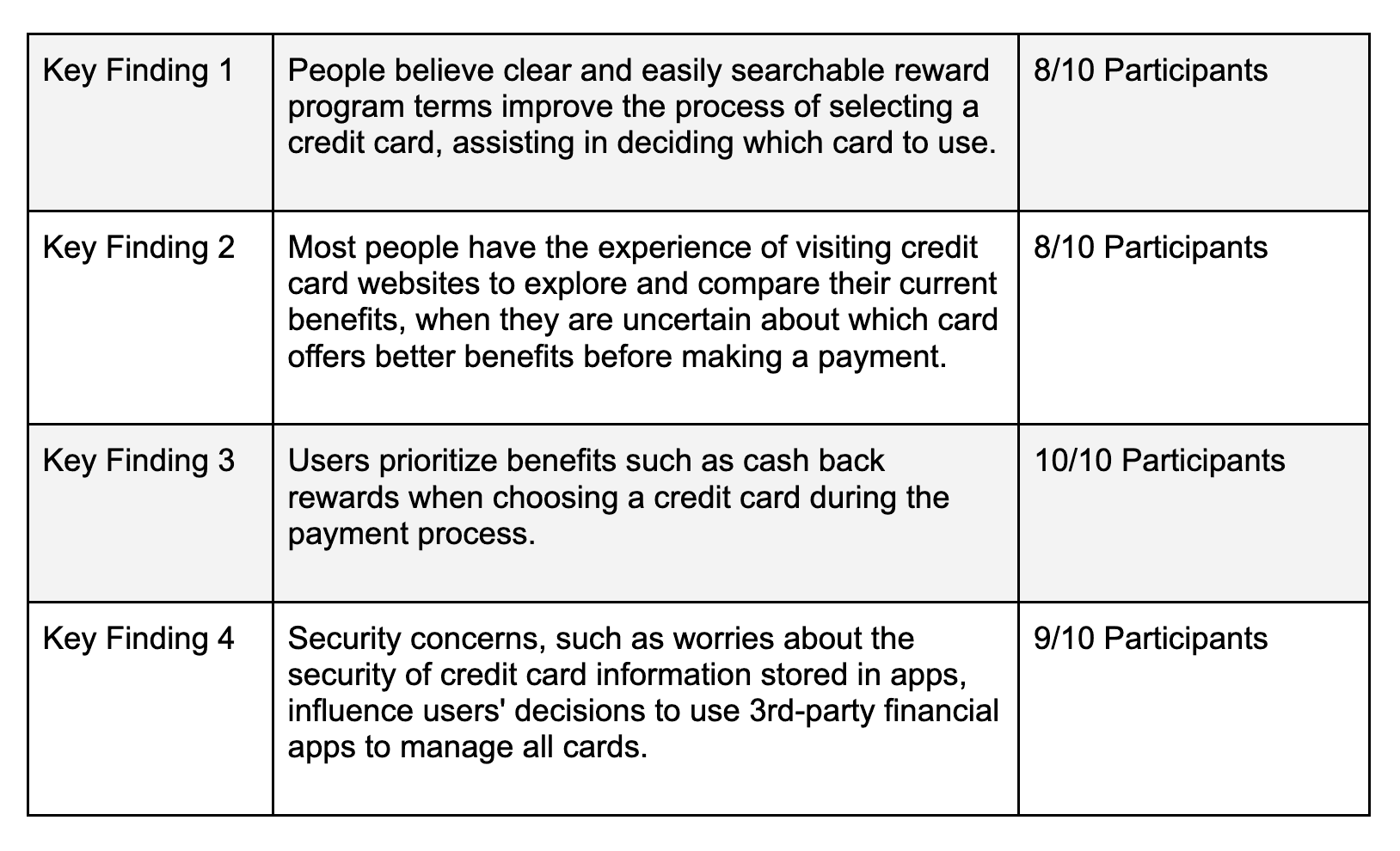
In total, I received 10 responses, providing a comprehensive dataset for analysis. Following the survey, I analyzed the responses to uncover key insights into the challenges and decision-making processes of managing multiple credit cards. These insights provide a deeper understanding of the factors influencing card selection during payment.
Jobs To Be Done (JTBD)
Based on the survey results and the analysis, I identified key jobs-to-be-done (JTBD) that reflect the essential tasks and goals individuals have when managing and selecting credit cards during the payment process.
- When I am struggling to select a card during the payment process within a time constraint, I want to compare the benefits offered by my credit cards for the specific merchant category, so I can efficiently choose the most appropriate credit card.
- When I am struggling to select a card during the payment process within a time constraint, I want to quickly identify the category of the current merchant, so I can maximize the benefits associated with my credit cards.
- When I am faced with the challenge of managing multiple credit cards and feeling overwhelmed, I want to securely store only non-sensitive data of my credit cards, so I can feel less anxious about the security of the credit card information stored in apps.
Problem Statements (HMW)
I created the "How Might We" statements to address the specific pain points identified in my research, aiming to simplify and enhance the user experience in managing multiple credit cards.
"How Might We"(HMW) statements:
- How might we simplify managing multiple credit card rewards programs to reduce confusion?
- How might we simplify the payment process for users facing time constraints, enhancing decision-making and ensuring optimal choices?
- How might we alleviate user concerns about inputting their credit card information into financial management apps?
- How might we reduce decision fatigue for users when selecting which credit card to use for specific purchases?
- How might we ease the burden of tracking changing bonus categories for credit card rewards?
Competitor Analysis
Building on the insights from the identified jobs-to-be-done, I conducted competitor research to examine how solutions like Google Wallet, Uthrive, and Credit Karma address similar challenges. I compared their approaches and features, providing a benchmark for evaluating potential improvements and innovations.
- With Google Wallet, users can manage credit cards by adding or removing them from the card list, access card information and benefits by clicking on the card image, and view available cards through the payment card management page.
- With Uthrive, users can search for a merchant to verify the category, receive card recommendations based on the current merchant, save credit card details without entering credentials, and compare the benefits of various cards.
- With Credit Karma, users can input credit card information to display and search reward program details, compare benefits across cards and receive new card recommendations, and manage the card list by adding or removing cards.
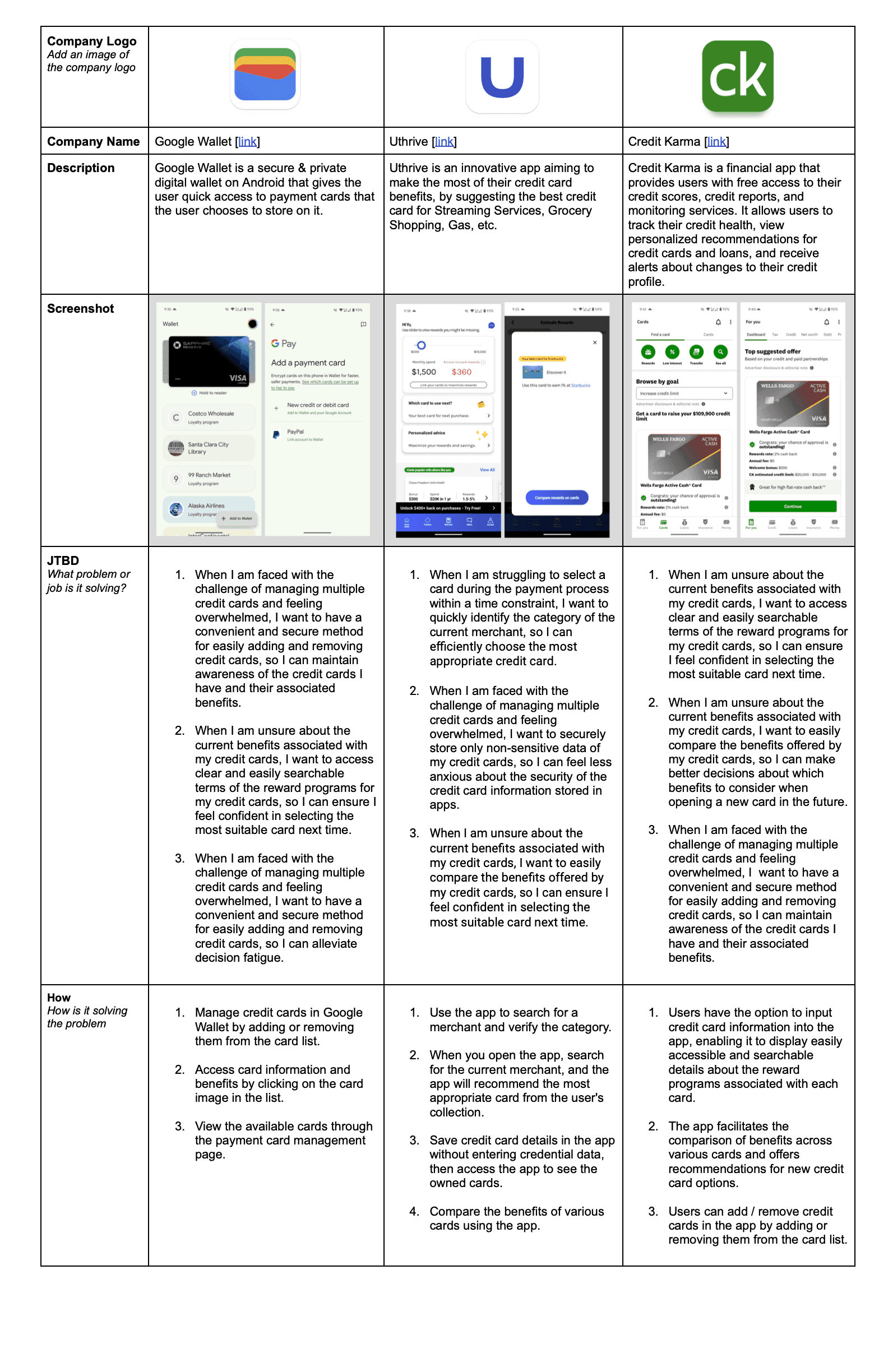
Competitor research and feature comparison
Ideation Sketches
Based on the "How Might We" statements, I brainstormed and created some design sketches to visualize potential solutions and iterate on ideas quickly. This step was vital in starting to ideate on my concepts, allowing me to explore and evaluate various approaches to address user challenges effectively.
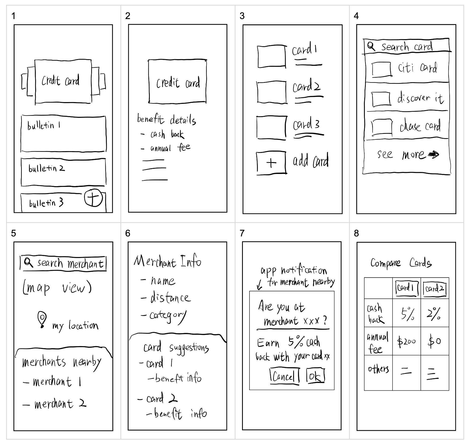
Design sketches and concepts
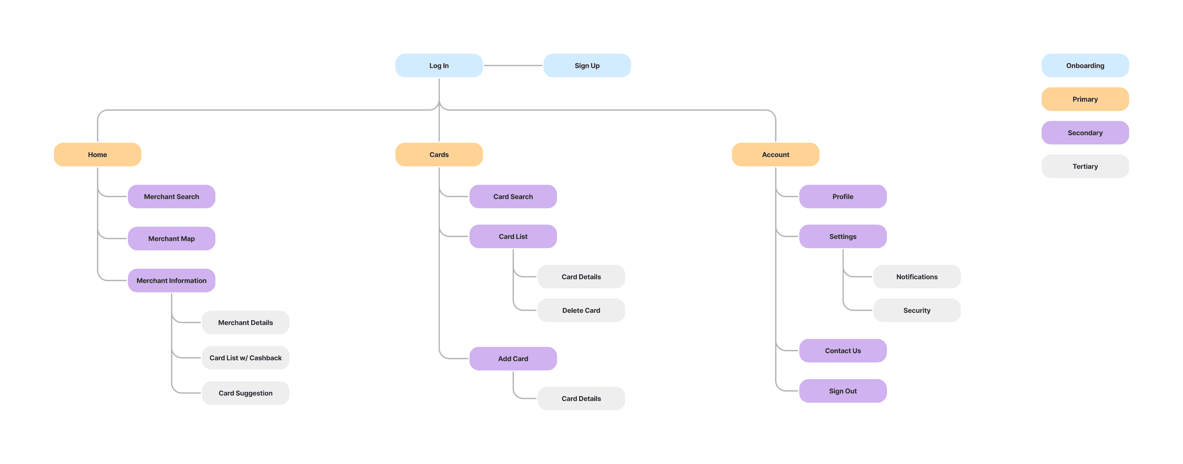
Information architecture and site structure
Site Map
Building on the user stories, the next step was to create a site map. A site map provided me with a bird's eye view of the entire app's content and how everything interconnects, ensuring intuitive navigation and easy access to information. This structure was essential for organizing the app logically and facilitated the smooth integration of additional features as development progressed.
User Flows
With the site map and user stories in place, the next step was to design user flows. I chose these flows because adding and removing a credit card are critical user journeys for effective credit card management. Additionally, searching for a merchant is important for determining the best card to use at a given merchant. These flows outline the steps users take for these essential tasks, ensuring a seamless and intuitive experience.
The main user flows:
- Search for a merchant
- Add a credit card to my account
- Remove a credit card from my account
User flow diagrams
Low-fidelity wireframe sketches
Sketches
With the user flows defined, I created sketches to draft and visualize the app's layout and interactions. Through this process, I learned that mobile app screens should not have too many elements, ensuring a clean and intuitive design. These sketches served as inspiration for creating the wireframes.
Mid Fidelity Wireframes
I began designing wireframes based on the sketches, progressing from low-fidelity to mid-fidelity with placeholder text and images for detailed iterations. This phase refined visual elements and interactions. Through this process, I learned to optimize space by minimizing excess white space, make card selections more intuitive with thicker borders and highlight labels, and use primary action buttons thoughtfully to maintain clarity and focus.
Mid-fidelity wireframe design 1
Visual inspiration and design direction
Mood Board
In regards to the imagery inspiration, the images I selected were minimalistic and visually appealing, reflecting the clean and lightweight nature of the brand. The overall colors and mood of these images evoked a sense of relaxation and reduced stress.
Regarding the UI inspiration from other apps, the minimal imagery helped users focus on the tasks, reducing distractions. A consistent style across the app ensured smooth navigation for users. The natural tones created a calm energy and convey a feeling of friendliness. The use of icons and cards boosted visual communication and enhances aesthetics and brand identity.
Style Guide
I chose cobalt blue as the primary color to give the app a more professional look. And I chose the Roboto font, popular for mobile apps and compatible with most systems, to ensure readability and uniformity. By aligning with the overall brand platform, the style guide not only enhanced the visual appeal but also reinforced BusyBee's identity, creating a seamless and cohesive user experience.
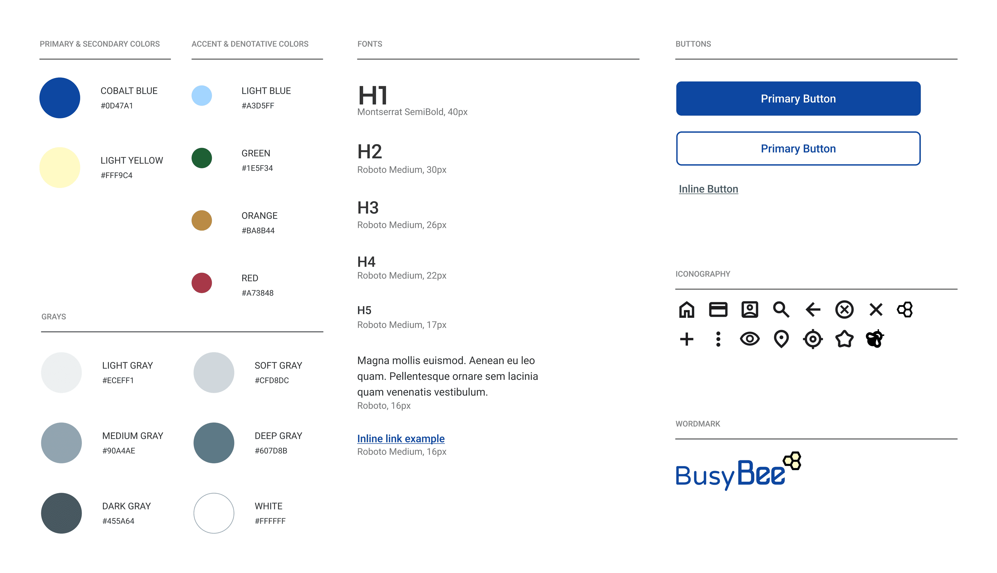
Design system and visual standards
High-fidelity UI design 1
High Fidelity Screens
I delved into the high-fidelity design phase, bringing the meticulously crafted wireframes to life with pixel-perfect precision.
While drawing inspiration from Google's Material Design guidelines for consistency and familiarity, I also navigated the challenge of ensuring compatibility with iOS design principles to create a seamless user experience across platforms. By prioritizing high-fidelity design, I aimed to deliver an intuitive and visually appealing app interface that aligned closely with user expectations and enhanced the overall user experience.
Prototype
By simulating user interactions and flow transitions, the prototype allows for a comprehensive understanding of how users navigate through the app. I also used the prototype to conduct usability testing.
Usability Testing
My objective for usability testing was to ensure that users can effortlessly navigate the app and identify any potential usability issues within the user flow. Through tasks such as finding a merchant, adding a credit card, and removing a credit card, I aimed to validate hypotheses regarding user interactions and streamline the app's functionality. Employing both remote and in-person moderated testing, I engaged with 5 participants who possess multiple credit cards and use them as their primary payment method, recruiting them through various channels including social media and personal networks.
The usability tests were conducted over Zoom or in person with 5 participants who presently possess 2 or more credit cards, use credit cards as primary payment methods, and have some interest or knowledge about credit card's benefits. I categorized the issues based on their importance, drawing from the results of the usability testing.
Findings
After conducting the usability testing sessions, I identified opportunities for improvement for the next design iteration. I categorized the findings by severity and provided recommendations for solutions.
Critical issues:
- Users found the cash-back information for irrelevant categories on the Merchant Details screen unnecessary.
- Users felt that the trash icon on each card item on the My Cards screen was too prominent and distracting.
- Users mentioned that the Merchant Search screen lacks distance information, making it unclear if the listed merchant is the desired one.
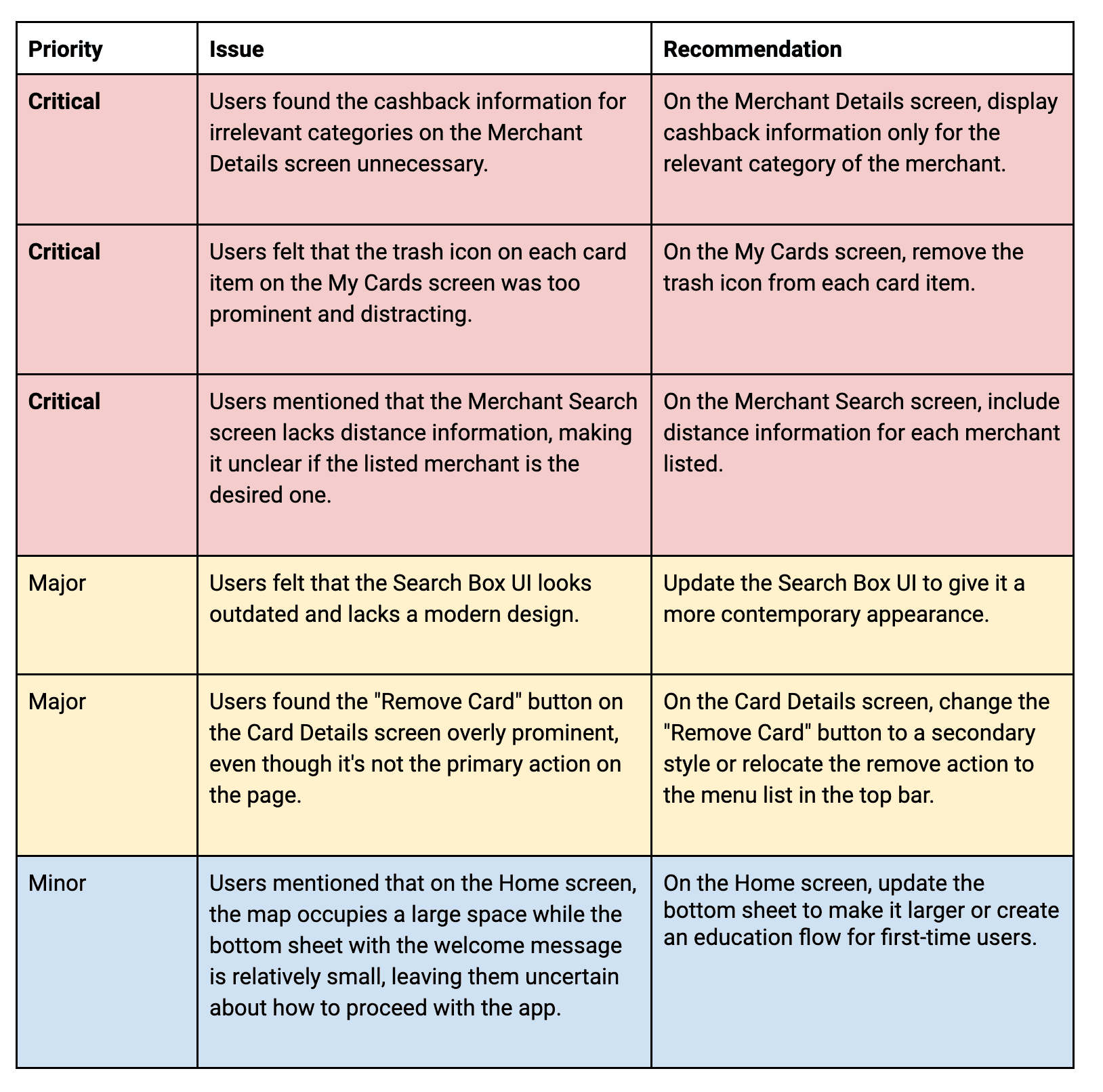
Key findings and recommendations
Redesign
Based on the issues identified during the usability testing, I redesigned key functionalities to address critical issues, including the Merchant Details screen, My Cards screen, and Merchant Search screen.
Issue 1
Users found the cash-back information for irrelevant categories on the Merchant Details screen unnecessary.
So I updated the design to display cash-back information only for the relevant category of the merchant.
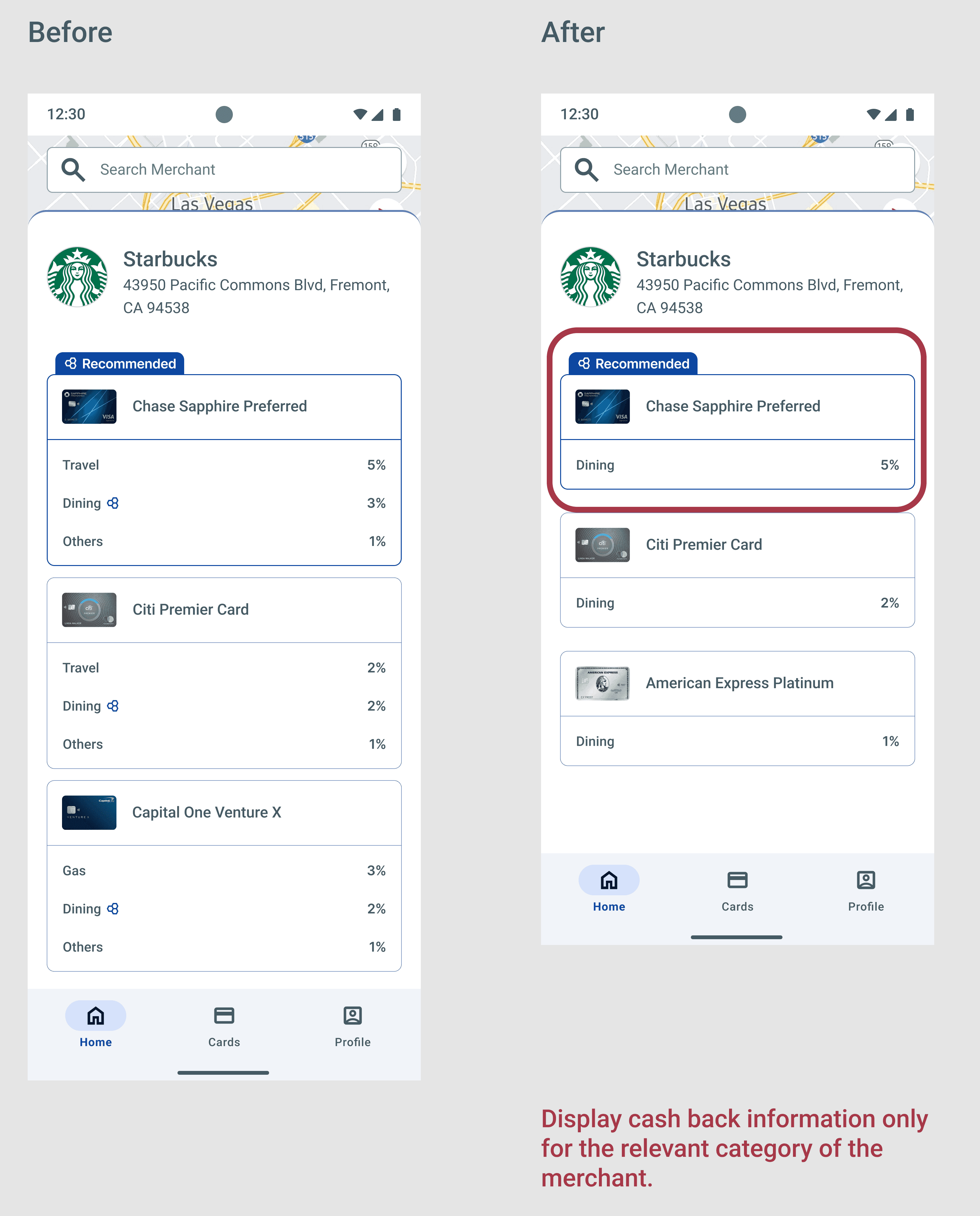
Merchant Details screen redesign
My Cards screen redesign
Issue 2
Users felt that the trash icon on each card item on the My Cards screen was too prominent and distracting.
So I updated the design to remove the trash icon from each card item.
Issue 3
Users mentioned that the Merchant Search screen lacks distance information, making it unclear if the listed merchant is the desired one.
So I updated the design to include distance information for each merchant listed.
Merchant Search screen redesign
What did I learn from the project?
My experience as an Android app developer greatly enriched my UX design process, enabling me to address problems and solutions from both a user perspective and an engineering perspective with a focus on design guidelines and engineering feasibility. Placing the user at the heart of the design process is essential, requiring their input at various stages, such as primary research and usability testing, to ensure the final product addresses their needs and effectively solves their real-world problems. Additionally, the design process is inherently iterative, and it requires multiple revisions and ongoing discussions; it's important to embrace these challenges and be prepared for questions and changes to refine the design effectively.
What would I do differently in the future?
In the future, I would approach primary research using a variety of methods beyond just distributing surveys. Conducting interviews would allow me to gather qualitative and generative insights, helping me understand the problem more deeply. Additionally, I would focus on making the app more visually appealing, beyond just its main functions and overall navigation, as the app's appearance plays a crucial role in enhancing user experience and satisfaction.