BusyOtter Merchant Portal
A full-cycle UX and UI design project for the BusyOtter Merchant Portal, a platform that enables business owners to monitor call analytics, manage AI agents, and streamline customer interactions.
BusyOtter website design showcasing the product
Overview
BusyOtter is a Voice AI Agent that answers and manages customer calls for small businesses. The BusyOtter Merchant Portal was designed to give business owners a simple, intuitive way to monitor performance metrics, review call histories, and manage their AI agents, stores, and menus.
Problem
After launching the BusyOtter product website and finalizing the design system, we needed to design a merchant portal for business owners to view performance metrics, access call logs, and manage their AI agents, stores, and menus, all within a unified, easy-to-use interface.
Solution
We created a clean, modern, and responsive merchant portal that aligns with the BusyOtter brand system. The design emphasizes usability and clarity, ensuring business owners can easily monitor performance and manage operations across desktop, tablet, and mobile devices.
Role
Lead and sole UX/UI Designer and Frontend Engineer
Tools
- Figma (Design&Prototyping)
- Jira (Project Management)
- Notion (Documentation)
- Google Meet & Slack (Team collaboration)
Process
- Discover
- Define
- Design
- Deliver
- Reflection
Project Kickoff & Stakeholder Alignment
As the second design project for BusyOtter, this work builds upon the established brand foundation and design system from the product website. With a clear understanding of the product's vision and audience, small business owners, we set out to design the merchant portal where users can view performance metrics, review call history, and manage AI agents and stores.
During the kickoff meeting, the engineering lead outlined backend capabilities and proposed core MVP features. Together, we aligned on the initial information architecture and agreed to extend the existing design system for consistency, introducing new colors, components, and typography scales where needed.
Stakeholder Insights
I visited several restaurants and interviewed owners and store managers to gather first-hand insights into their needs and pain points. Through conversations with restaurant owners and early users, several key needs emerged:
- Ensure every customer call is answered, avoiding missed phone orders.
- Provide visibility into AI call handling through a clear call history log.
- Use dashboard metrics to track performance and build trust in the AI agent.
- Maintain staff satisfaction by ensuring AI agents handle routine tasks reliably without creating extra work.

Competitive analysis and design principles
UX Research & Key Insights
To better understand industry standards and user expectations, I analyzed AI agent platforms such as Vapi, Revmo, Loman, and Goodcall, which offer similar functionalities to BusyOtter. Since these competitors already have mature, feature-rich platforms, their interfaces are relatively complex. In contrast, BusyOtter is in its early phase, so I focused on designing a streamlined MVP that highlights the core features most valuable to business owners.
Drawing from Jakob Nielsen's heuristics and competitive research, I identified several key principles to guide the design:
- Intuitive Navigation. A collapsible left-hand sidebar helps users easily switch between sections.
- Clear Information Architecture. The portal is structured around core pages. Dashboard, Phone Calls, Agents, and Stores, allowing users to quickly locate key features.
- Manageable Content Sections. Each page uses a card-based layout to present information clearly and enable quick interactions.
Action Plan
After sharing my UX research and insights with the engineering lead, we aligned on the following next steps:
- Extend the existing design system and branding from the BusyOtter product website for consistency.
- Design and build the merchant portal MVP, including core pages such as Dashboard, Phone Calls, Agents, and Stores.
Defining the Goal
With research insights and stakeholder input in place, the next step was to clearly define the project goals and prioritize core functionalities that would shape the overall structure and user experience of the merchant portal.
Inspiration from modern product websites
Ideation
During the ideation phase, I explored how the merchant portal could make AI-driven call management intuitive and transparent for business owners. I gathered design inspiration from modern, product-focused websites such as Jira, Vapi, and curated examples from Dribbble. These references offered valuable insights into how leading tech brands present complex technology through simple, human-centered design.
Key takeaways:
- Clean, card-based layouts improve clarity and organization.
- Consistent design language helps build trust and ease of use.
- Clear hierarchy between business-level, store-level, and agent-level information enhances navigation and comprehension.
Low-Fidelity Wireframes
Using insights from the ideation phase, I created low-fidelity wireframes to define the layout, hierarchy, and content flow, establishing a clear visual rhythm that highlights BusyOtter’s merchant portal.

Wireframes defining layout and information hierarchy
From Concept to Design
Building on the insights from the definition phase, I transitioned from low-fidelity wireframes to detailed visual design. The focus was to translate structure into a clean, modern interface that feels intuitive and aligned with BusyOtter’s friendly, professional brand tone.
Brand identity and visual language
Style Guide
I previously created the design system for the BusyOtter product website, so for this project, I reused and extended it to maintain visual consistency across products. This included keeping consistent colors, typography, and components, while introducing new UI patterns such as dashboard cards and editable layouts tailored for the portal experience.
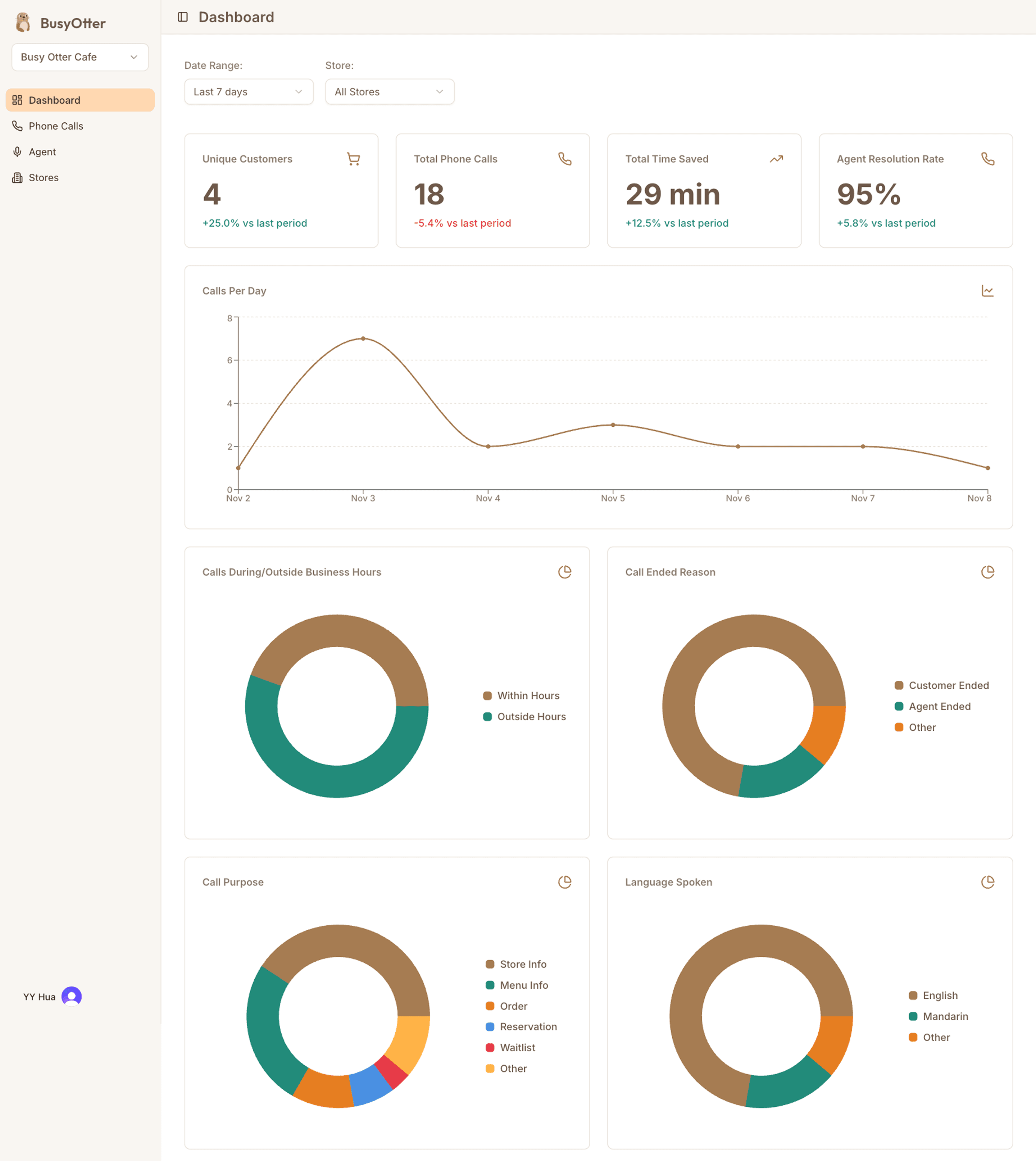
High-Fidelity UI Design
Using the style guide and wireframes, I created polished, high-fidelity screens that visualize the full user flow and serve as the foundation for implementation.
Pixel-perfect designs for all key pages
Iterations & Refinement
I went through multiple rounds of design iteration to improve usability and align with real user needs.

Edit/Save workflow design
Edit/Save Workflow
Initially I designed a global save/cancel sticky panel, but due to technical and usability constraints, I compared several alternatives — global save, per-card save, per-field save, and auto-save. After testing and team discussions, we finalized the per-card save/cancel approach for better clarity and control.
Operating Hours
Iterated from inline day-by-day editing to a modal dialog for focused editing and improved user flow. Added a "Parse from Text" feature to let users easily import store hours.
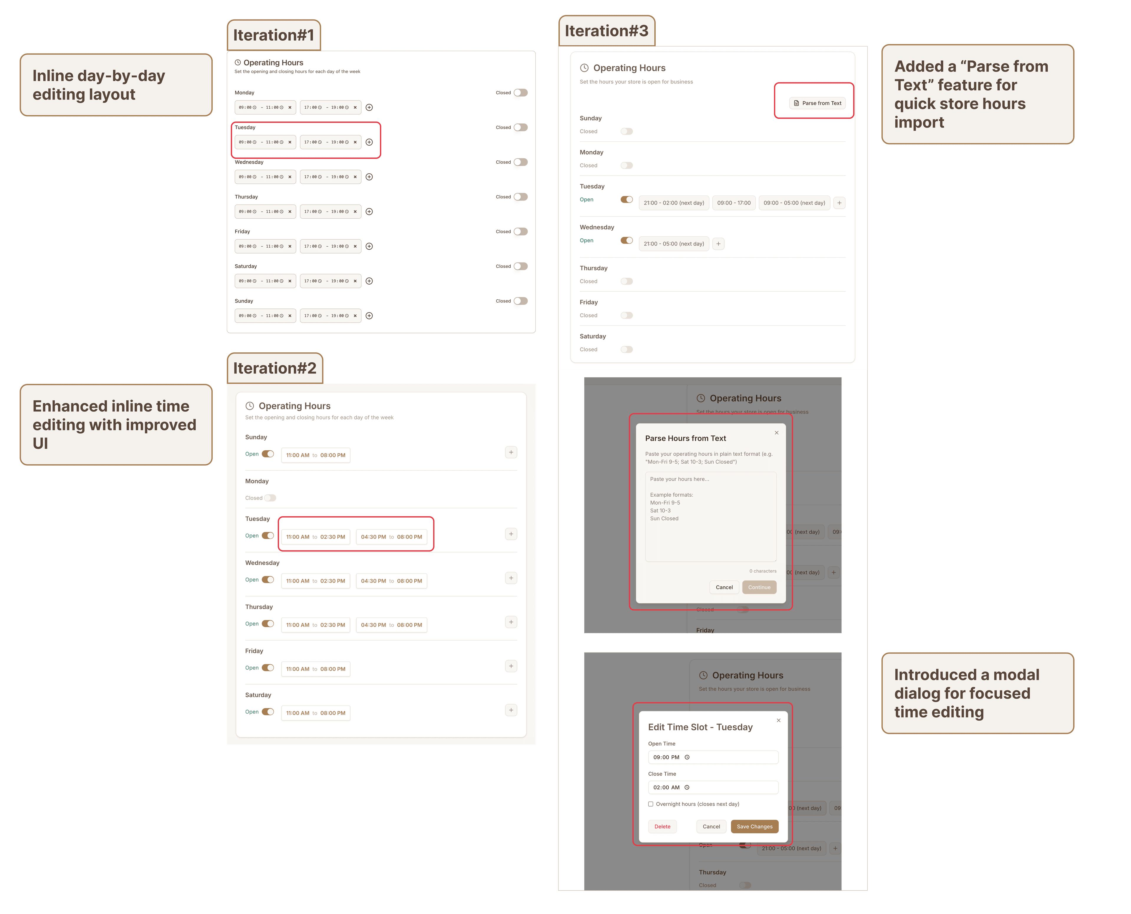
Operating hours design
FAQ management design
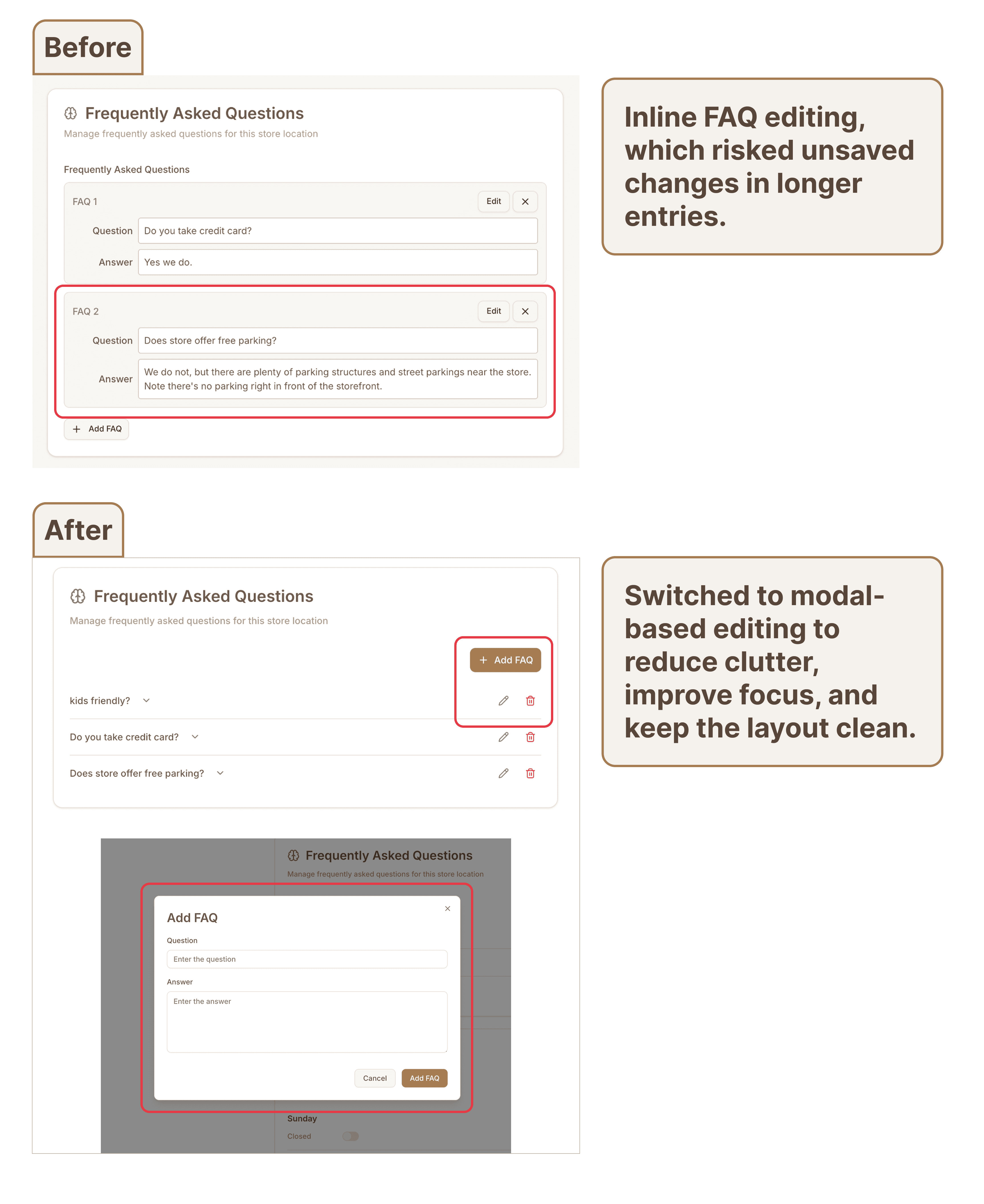
FAQ Management
Shifted from inline editing to modal-based editing to reduce clutter and avoid unsaved changes in long FAQ items. This change improved focus, minimized visual noise, and kept the layout clean.
Responsive Design
Designed for business owners who often check metrics and call history on the go, the portal seamlessly adapts across devices while maintaining clarity and usability.
Key responsive adaptations include:
- Optimized font sizes for better mobile readability
- Collapsible left navigation to maximize screen space
- Phone call details expand from side panel to full screen on mobile
- Chart cards redesigned for smaller layouts
- Horizontal cards reordered into vertical stacks on narrow screens
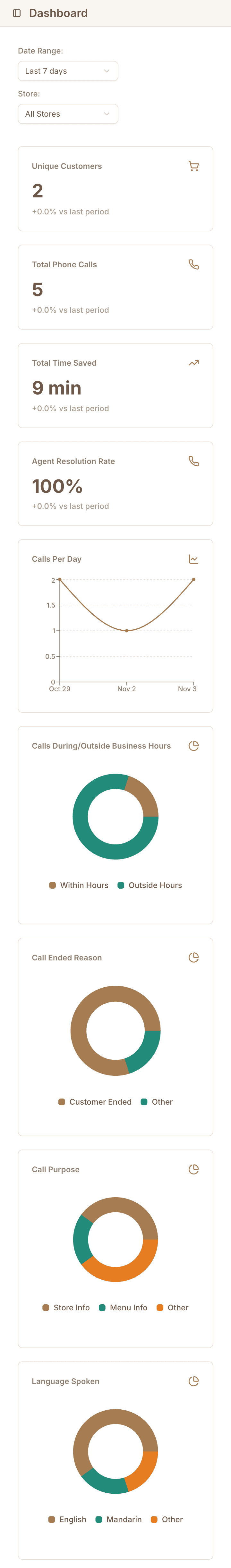
Responsive design across devices

Design system components
Design System
The design system was first established in the BusyOtter product website project and extended for the merchant portal. This ensured a cohesive visual language across all BusyOtter products.
- Logo: Cartoon-style otter to convey friendliness and warmth.
- Color palette: A harmonious combination reflecting warmth and approachability, balanced with a sense of innovation. The sandstone brown primary color anchors the palette.
- Typography: Clean, modern fonts (Inter) for readability and a tech-forward aesthetic, ensuring compatibility across devices.
Design Handoff
Spacing, color tokens, and component guidelines were documented in Figma for seamless handoff. Each component included responsive behavior notes, helping ensure accurate implementation. The system is versioned and continuously updated as the product evolves.
Implementation & Collaboration
As the frontend engineer, I built the entire merchant portal and worked closely with the founding engineer throughout implementation. Figma design tokens were mapped directly into code to preserve consistency and responsiveness. The final product of BusyOtter Merchant Portal is live at https://console.busyotter.ai/.
Challenges
This project presented several challenges that required thoughtful problem-solving:
- Balancing information and clarity. Ensuring the portal displays sufficient data while maintaining a clean, easy-to-scan layout.
- Responsive design. Adapting complex dashboards, tables, and diagrams for mobile use. Since our target audience business owners like restaurant managers, often access the portal on the go, we introduced mobile-friendly patterns such as slide-in panels and editable store hours.
- Bridging UX and engineering perspectives. Implementing data-heavy pages required balancing technical feasibility with user experience. For instance, managing multiple HTTP endpoints per page led to organizing data into cards and optimizing how it's fetched and rendered.
Future Improvements
With the foundational website launched, there are several opportunities for future enhancement:
- Self-onboarding flow. Enable business owners to register and set up their accounts independently, reducing manual setup for new merchants.
- Merchant portal redesign. Evolve the portal into a general-purpose platform to support upcoming products beyond the Voice AI Agent, such as in-store ordering.