BusyOtter Product Website
A full-cycle UX design project to build BusyOtter’s first product website by defining its brand identity, design system, and responsive experience from the ground up.
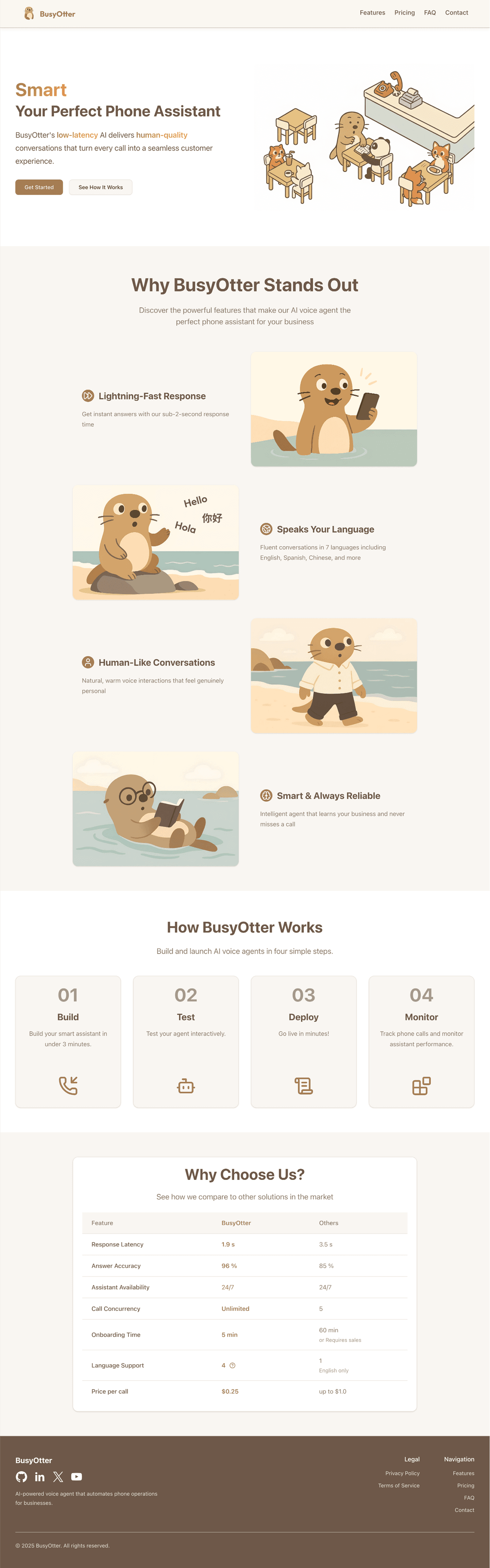
BusyOtter website design showcasing the product
Overview
BusyOtter is a voice AI agent designed to handle phone calls for small businesses such as restaurants, milk tea shops, and other local service providers. Powered by low-latency AI technology, BusyOtter delivers natural, human-like conversations that help businesses manage customer calls efficiently and provide a seamless experience every time.
The Challenge
At the early stage of product development, BusyOtter had a working prototype of its AI voice agent but lacked a public-facing website to introduce the product to potential customers.
The team needed a marketing website that could:
- Clearly communicate the product's value and features.
- Provide transparent pricing and contact options.
- Build credibility and drive conversions through a professional and cohesive design.
The Solution
As the founding UX designer, I led the end-to-end design and development of BusyOtter's product website from scratch. This included:
- Establishing a scalable design system.
- Designing and building all web pages with a cohesive, consistent and modern visual identity.
- Creating a smooth information flow to help visitors quickly understand the product and take action.
The goal was to design a website that not only looks cohesive and modern but also effectively communicates the product's value and makes it easy for potential customers to reach out.
Role
Lead and sole UX/UI Designer and Frontend Engineer
Tools
- Figma (Design&Prototyping)
- Jira (Project Management)
- Google Meet & Slack (Team collaboration)
Process
- Discover
- Define
- Design
- Deliver
- Reflection
Project Kickoff & Stakeholder Alignment
Since BusyOtter's website was being built from scratch, it was crucial to first understand the product vision, business goals, and target users.
During the kickoff meeting with the lead engineer, we reviewed BusyOtter's core features and discussed expectations for the website. We aligned on key objectives:
- Build a responsive landing site optimized for desktop, tablet, and mobile.
- Ensure the site reflects BusyOtter's product value clearly.
- Define next steps for UX research and design planning.
Analysis of competitor websites and design patterns
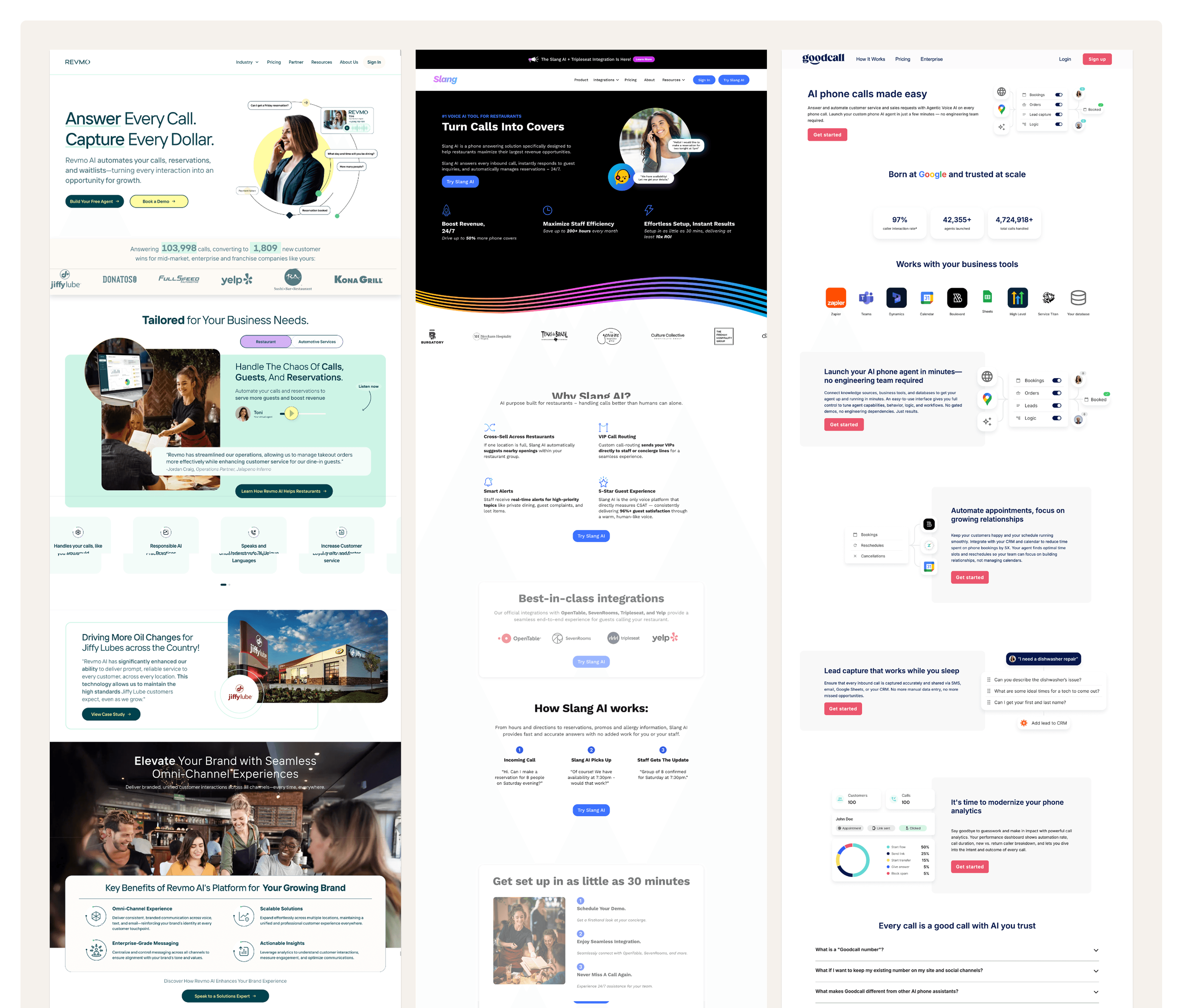
Competitive Research
I conducted a competitive analysis of existing AI agent websites, including Revmo, Slang, and Goodcall, to understand current market standards and identify opportunities. I paid close attention to their information architecture, visual design, and content strategy, noting the following patterns:
- The tone of voice across these sites is friendly.
- Websites prioritize a clean, modern aesthetic, highlighting product value, core features, and clear CTAs.
- Transparent pricing sections and accessible contact options build trust.
For BusyOtter's early-stage website, I decided to adopt a modern, concise design direction:
- Showcase product features clearly.
- Provide visible, easy-to-access contact options.
- Avoid unnecessary content clutter that distracts from the core message.
Key Insights
Drawing on Jakob Nielsen's Heuristics and my competitive research, I identified several opportunities to guide the design:
- Responsiveness. The website must perform seamlessly on mobile devices, enabling quick demos or client introductions directly from a phone.
- Clarity of differentiation. Clearly emphasize core strengths like low latency and natural, human-quality conversations.
- Simple user journey. Keep the contact form short and straightforward to encourage more inquiries.
Action Plan
After sharing the research findings with the lead engineer, we aligned on an action plan to move forward:
- Establish a design system and brand identity (including logo).
- Design and develop a multi-page website: Home, Features, Pricing, and Contact.
Defining the Goal
Building on insights from the Discovery phase, I translated research findings into actionable design goals. The website needed to:
- Communicate BusyOtter's value proposition clearly and quickly.
- Showcase core features and pricing with a modern, trustworthy design.
- Provide straightforward ways for visitors to reach out or request a demo.
I first outlined the Information Architecture (IA) to ensure a logical and intuitive user flow. I mapped out the key pages and content hierarchy, defining the core structure: Home, Features, Pricing, FAQ, and Contact, ensuring users could easily navigate and understand the product at a glance.
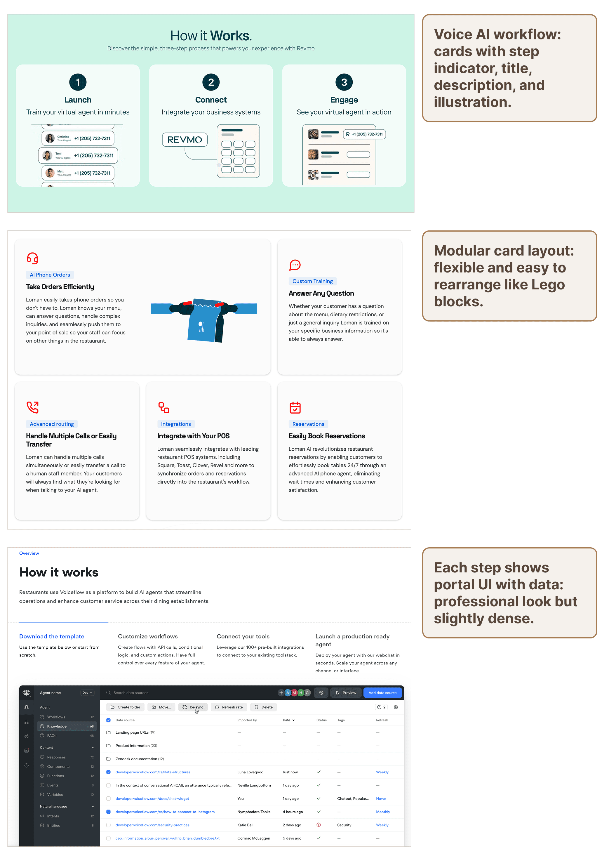
Inspiration from modern product websites
Ideation
To establish a visual and interaction direction for BusyOtter's website, I explored modern product websites such as Oura Ring, Linear, and curated inspiration from Dribbble.
These examples provided valuable insights into how leading tech brands communicate complex technology in a simple, human-centered way.
Key takeaways:
- Clean, card-based layouts improve clarity and organization.
- High-resolution imagery integrated with concise text enhances professionalism.
- Subtle animations and motion create a dynamic, engaging experience.
Low-Fidelity Wireframes
Using insights from the ideation phase, I began sketching and prototyping low-fidelity wireframes to define layout structure, information hierarchy, and content flow.
The goal was to establish a clear visual rhythm that effectively highlights BusyOtter's core value propositions and call-to-action elements.
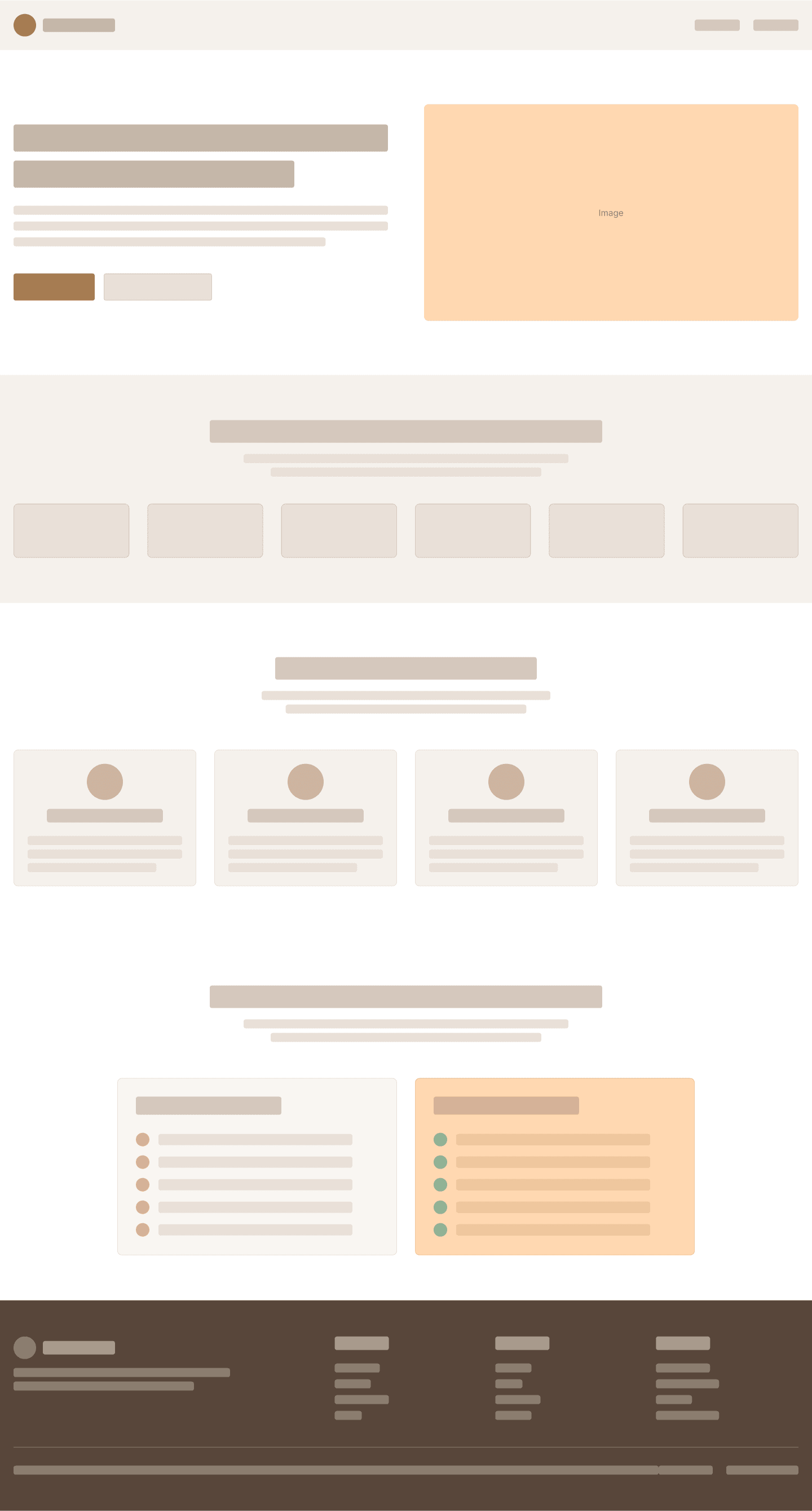
Wireframes defining layout and information hierarchy
From Concept to Design
Before diving into detailed visuals, I translated insights from the Definition phase into concrete design directions. My goal was to ensure the website reflects BusyOtter's brand personality while providing a seamless user experience across devices. This phase focused on three key areas:
- Building a scalable design system.
- Crafting high-fidelity UI screens.
- Iterating based on team feedback and testing.
- Responsive design for different screen sizes.
Brand identity and visual language
Style Guide
To establish a cohesive visual language, I created a brief style guide centered around BusyOtter's brand identity — friendly, approachable, and modern. The logo features a playful cartoon otter that reflects the product's warmth and reliability, while the primary sandstone brown color conveys trust and friendliness.
This initial guide informed all high-fidelity designs and later evolved into a full design system, detailed in the Delivery section.
High-Fidelity UI Design
Guided by the design system, I transformed wireframes into pixel-perfect high-fidelity screens that visually expressed the product's story and functionality.
The design emphasized clarity, contrast, and responsiveness, ensuring the experience feels natural on both desktop and mobile.
Each page was designed to guide visitors toward conversion while maintaining visual balance and brand consistency.
Pixel-perfect designs for all key pages
Iterations & Refinement
Design refinement was a collaborative process involving continuous feedback from engineering and team discussions. I conducted several iterations to enhance usability and visual flow.
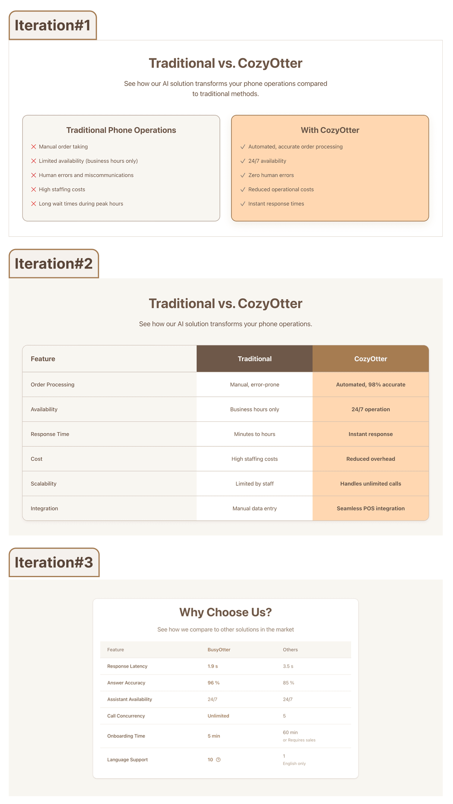
Pricing table redesign
Pricing Comparison Table
Early design used two independent cards, which made side-by-side comparison difficult. Redesigned into a simplified, unified layout for easier comparison and scanning.
Contact Form Simplification
Initial version contained too many required fields, creating friction. Reduced form fields to essential information and made secondary inputs optional, improving completion rate and user experience.
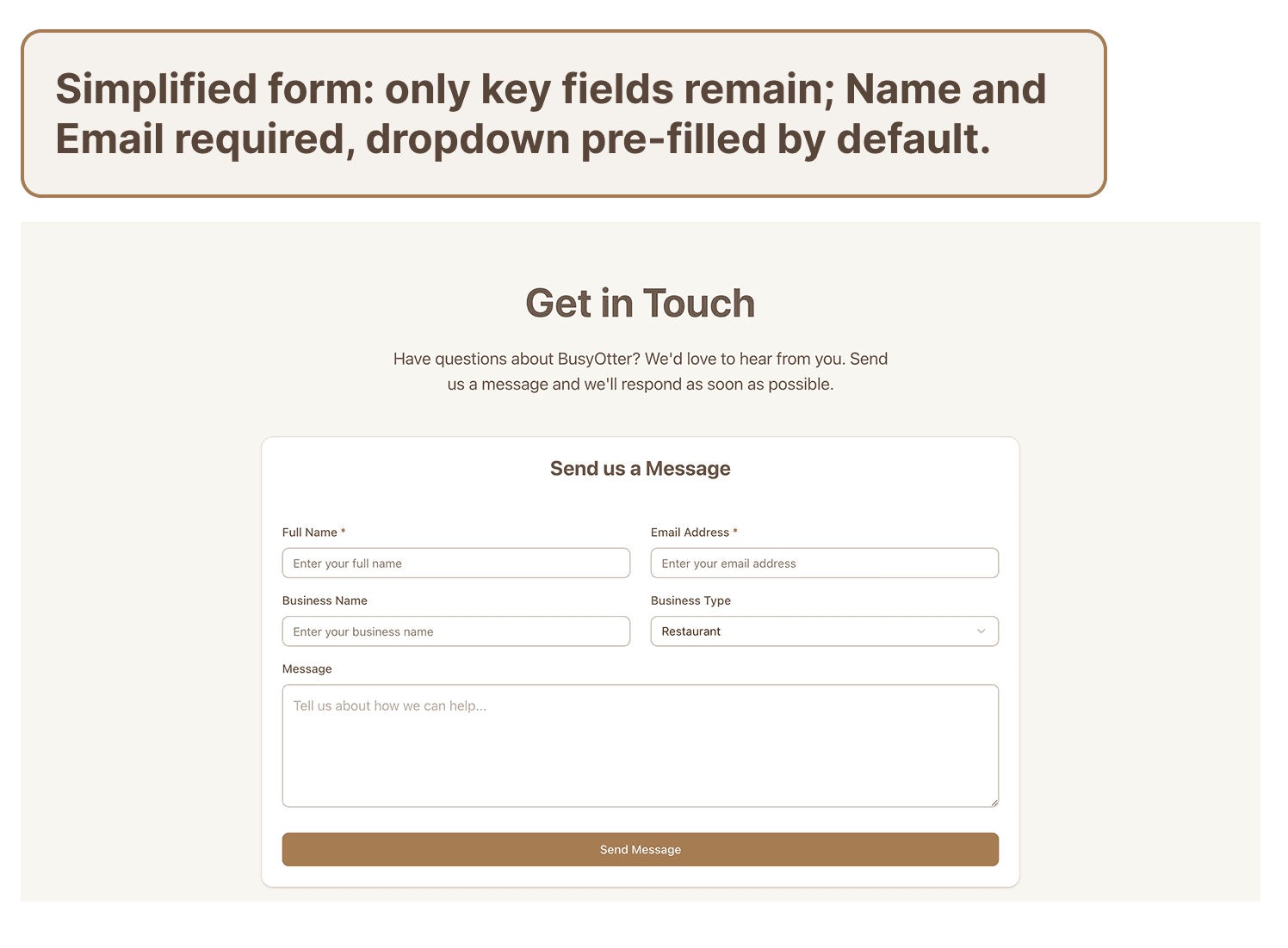
Contact form redesign
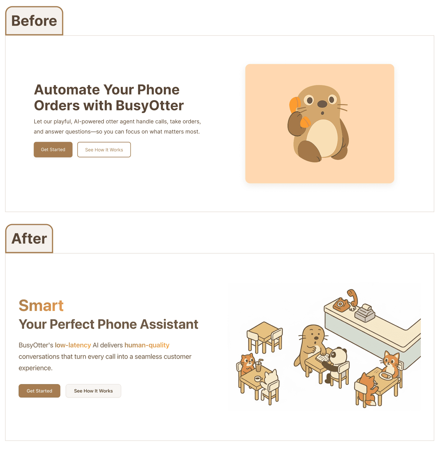
Homepage animated headline
Animated Headline
Introduced a subtle text animation on the homepage to highlight BusyOtter’s key qualities: fast, smart, natural. This small motion element draws attention and reinforces product personality.
Responsive Design
From desktop to mobile, the design adapts seamlessly to different screen sizes — maintaining visual clarity, usability, and brand consistency across all devices.
Key responsive adaptations include:
- Optimized font sizes for mobile readability.
- Top navigation transforms into a compact menu icon.
- Horizontal layouts reflow into vertical stacks for better legibility.
- A dedicated mobile layout for the features card switcher ensures smooth interaction and visual balance.

Responsive design across devices

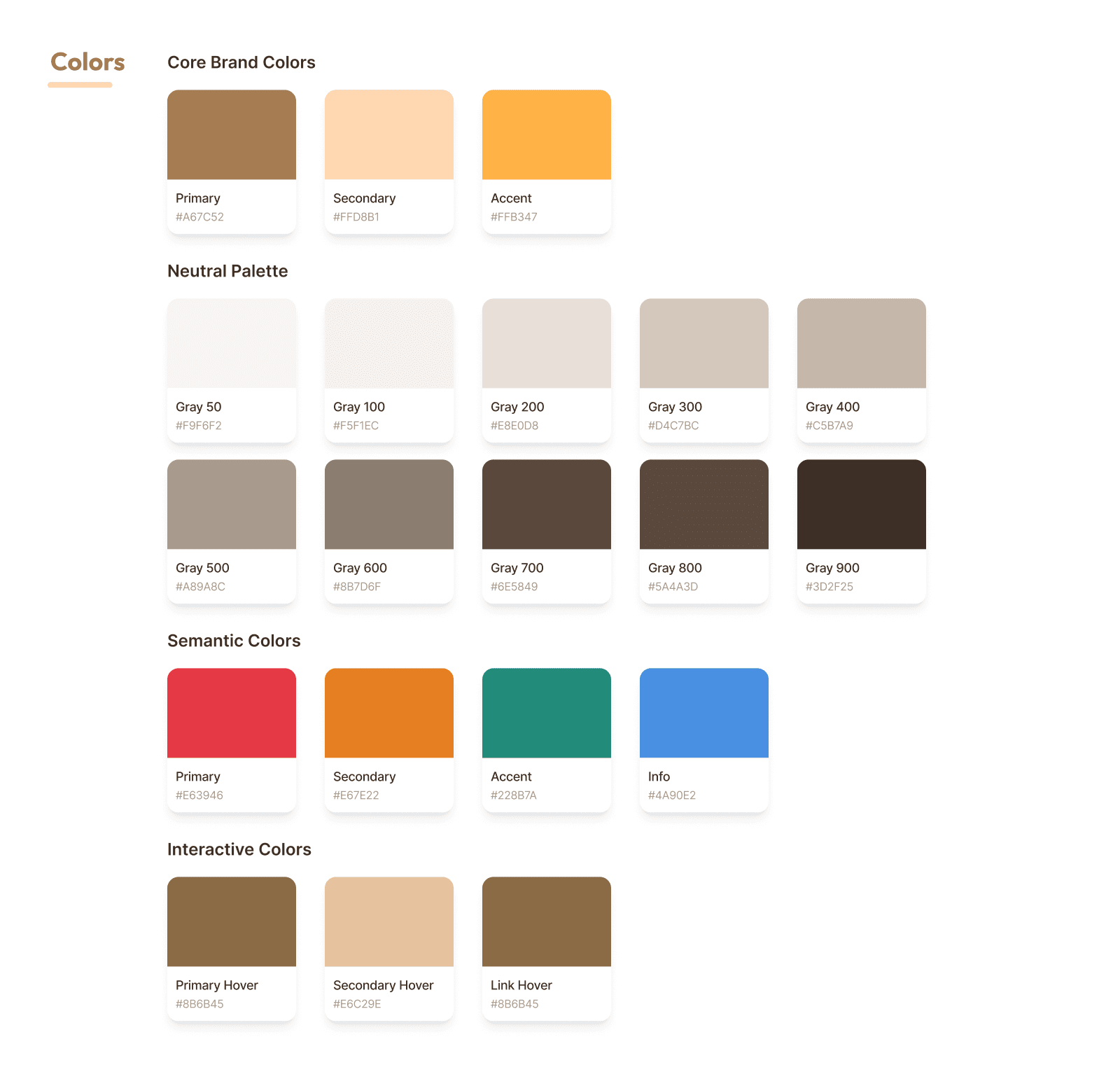
Design system components
Design System
The design system formalized our visual decisions into a scalable framework. It defined color tokens, typography hierarchy, button and card components, spacing rules, and iconography to ensure visual consistency across pages.
- Logo: Cartoon-style otter to convey friendliness and warmth.
- Color palette: A harmonious combination reflecting warmth and approachability, balanced with a sense of innovation. The sandstone brown primary color anchors the palette.
- Typography: Clean, modern fonts (Inter) for readability and a tech-forward aesthetic, ensuring compatibility across devices.
Design Handoff
I documented spacing, color tokens, and component usage directly in Figma to ensure a smooth handoff.
Each component included responsive behavior and usage notes, allowing engineers to implement designs accurately.
The system is versioned in Figma and updated alongside product growth to maintain consistency.
Implementation & Collaboration
As the frontend engineer, I collaborated closely with the founding engineer to implement the design system using Tailwind CSS and shadcn/ui.
Figma design tokens were translated directly into code to maintain visual consistency and responsiveness across devices.
The final design is now live at https://busyotter.ai/.
Challenges
This project presented several challenges that required thoughtful problem-solving:
- Designing from Scratch. As BusyOtter's first UX/UI designer, I started without an existing design system or brand identity. Defining the visual direction, tone, and website structure from the ground up was both exciting and challenging.
- Balancing Information and Simplicity. Communicating enough information about an AI-driven product without overwhelming visitors required careful prioritization.
- Explaining AI Value Clearly. Translating BusyOtter's technical capabilities (like low-latency AI and natural conversations) into simple, engaging messaging was an ongoing UX and content challenge.
Future Improvements
With the foundational website launched, there are opportunities for future enhancement:
- Pricing Page Refinement: Continue testing layout and content clarity to better communicate plan differences and improve conversion.
- Interactive Demo Section: Add an embedded demo or "Try It Now" section on the homepage so visitors can instantly experience BusyOtter's capabilities.
- Ongoing User Feedback: Once traffic increases, conduct usability testing and analyze behavioral data to inform future iterations.
- Partner Carousel: Introduce a carousel highlighting partner businesses or customer logos to build trust and social proof.
- "How It Works" Enhancement: Expand this section with simple visuals or motion graphics to better illustrate BusyOtter's process and AI technology.
Key Learnings
Working as both designer and front-end engineer taught me how to balance creative vision with technical feasibility, ensuring the final product was both beautiful and practical to build.
Through this project, I learned how to translate complex AI technology into a clear, approachable user experience while defining structure from ambiguity. Balancing design and implementation taught me to create solutions that are both human-centered and technically feasible.